Why List-Based Service Pages Fail to Convert (And How Visual Grids Fix It)
Text service lists bore visitors. Learn how visual service grids increase service inquiries by 289%...
A marketing agency's services page displays a vertical list of text blocks: "SEO Services - We optimize your website for search engines. Social Media Marketing - We manage your social media presence. Content Creation - We create engaging content." Each service gets 3-4 sentences in Times New Roman on a white background.
A prospect visits seeking social media help, scans the wall of text for 8 seconds, can't quickly identify relevant services or differentiate between basic and premium packages, closes the tab, and contacts a competitor whose interactive grid showcased services with icons, pricing tiers, and "Learn More" buttons that opened detailed service modals.
Same service quality. Same expertise. Different presentation. One agency loses prospects to information overload presented in unapproachable text walls; the other converts browsers through scannable visual grids that make service discovery effortless and value communication immediate.
This article reveals why traditional text-list service pages fail to engage modern visitors despite comprehensive offerings and how interactive services grids transform dense service descriptions into discoverable, comparable, actionable service showcases.
5 Critical Problems Text-List Service Pages Create
1. Text Walls Prevent Quick Scanning and Service Discovery
Eye-tracking research shows web users scan pages in F-patterns spending 0.5-2 seconds per section before scrolling. Dense paragraph descriptions of 8-12 services create overwhelming text walls where individual services become indistinguishable blurs.
Visitors seeking specific services ("Do they offer PPC advertising?") must read every service description hoping to spot relevant keywords. This cognitive load exhausts patience—67% of service page visitors abandon before reading all offerings simply because discovering whether you offer their needed service requires too much effort.
The Mobile Readability Crisis: Desktop users struggle with text-heavy service lists; mobile users face catastrophic reading burdens. Paragraph descriptions formatted for desktop become endless mobile scrolls—a 6-service page requiring 2 desktop screens becomes 8+ mobile screens of continuous text. When 65-75% of B2B research happens on mobile, text-list service pages optimized for desktop create hostile mobile experiences for the majority discovering your services. You're hiding offerings behind readability barriers the moment prospects try to find them.
2. No Visual Hierarchy or Service Differentiation
Text lists present all services with equal visual weight regardless of importance, profitability, or demand. Core revenue-driving services appear identical to minor offerings. Premium packages look indistinguishable from basic tiers.
This lack of visual hierarchy fails to guide attention or communicate service relationships. Visitors can't quickly identify "what do they specialize in?" or "which service tier matches my needs?" Everything looks equally important (or equally unimportant), preventing the quick value assessment modern buyers demand before investing reading time.
3. Missing Pricing, Comparison, or Action Paths
Traditional service lists describe what services are but omit actionable information: pricing ranges, service tier comparisons, delivery timelines, or clear next-step CTAs. Descriptions end without guidance: "We offer consulting... [end of section]."
This information gap forces interested prospects to hunt for pricing pages, contact forms, or portfolio examples—friction that 73% abandon rather than navigate. You've created interest ("this service sounds relevant") but provided no immediate path to "how much does it cost?" or "can I see examples?" leaving prospects in limbo between interest and action.
4. Static Presentation Prevents Interactive Exploration
Fixed text descriptions can't expand to show details, collapse to reduce clutter, or adapt to user interests. Every visitor sees identical static content whether they're executive-level decision makers seeking strategic overview or technical implementers needing specification details.
This one-size-fits-all presentation forces you to choose: Provide high-level summaries (leaving technical buyers wanting more detail) or include comprehensive specifications (overwhelming executive buyers with technical density). Either choice sacrifices conversion from half your audience because static formats can't accommodate different information needs.
5. No Visual Interest or Professional Polish
Text-only service listings lack visual engagement elements: No icons, no images, no color coding, no hover effects, no interactive elements. Result: Pages feel outdated, unprofessional, and low-effort—"if they won't invest in presenting services well, will they deliver services well?"
This perception problem particularly damages professional service firms, agencies, and consultancies where presentation quality directly signals execution quality. Your text-list services page communicates "we don't prioritize user experience or visual communication"—ironic for businesses selling those exact capabilities.
6 Solutions Interactive Services Grids Deliver
1. Visual Card-Based Layouts for Scannable Discovery
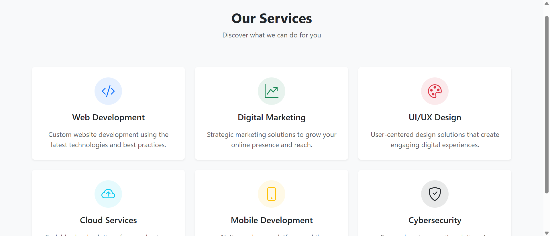
Interactive grids display services as visual cards in 2-4 column layouts: Icon or image, service name, 2-3 sentence summary, clear CTA button. This structure enables 3-second scanning identifying relevant services versus 30-second paragraph reading.
Card-based presentation leverages visual processing speed: Users glance at icon + headline combinations instantly recognizing "SEO," "Social Media," "Content"—then choose which cards merit detailed reading. This efficient discovery pattern respects user time while maintaining information accessibility for interested prospects.
The Pinterest Card Pattern: Card-based content display succeeded across web platforms (Pinterest, social media, news sites) because cards match how humans naturally categorize and compare options. Rather than forcing linear text reading, cards enable parallel visual scanning: See all options simultaneously, compare at a glance, select for deeper exploration. Interactive services grids leverage this proven pattern—not because it's trendy, but because it aligns with cognitive preferences for visual information processing and option comparison.
2. Hover Effects and Expandable Details
Modern service grids include interactive hover states revealing additional information: Pricing ranges appear on hover, service highlights expand, related case studies preview, or "Learn More" overlays provide quick details without navigation.
This progressive disclosure accommodates varying information needs: Scanners see essential info (service name, icon, brief description), interested prospects hover for details (pricing, deliverables, timeline), committed browsers click through for comprehensive information (full service pages, case studies, booking). One interface serves multiple decision stages.
3. Visual Icons and Imagery for Quick Recognition
Service cards include custom icons or relevant imagery creating instant visual recognition: Magnifying glass for SEO, megaphone for marketing, graph for analytics. These visual shortcuts accelerate comprehension and improve memorability.
Icon-based navigation works because visual symbols process 60,000X faster than text. Users recognize "chart icon = analytics service" in 0.2 seconds versus reading "Business Analytics and Data Visualization Services" requiring 2-3 seconds. This speed advantage compounds across 8-12 services—visual grids enable complete service discovery in the time text lists reveal first 2-3 services.
4. Filterable and Categorizable Service Organization
Advanced grids include filter controls organizing services by category (marketing, development, consulting), industry (healthcare, finance, retail), or service level (basic, professional, enterprise). Users narrow 15 services to 4 relevant options in two clicks.
This self-service organization reduces cognitive load: Instead of scanning all offerings hoping to spot relevant services, users actively filter to their needs. E-commerce companies filter to "e-commerce services," enterprise buyers filter to "enterprise tier," startups filter to "basic packages"—each seeing personalized relevant subset instead of overwhelming comprehensive catalog.
5. Clear Pricing and Comparison Frameworks
Well-designed service grids display pricing transparency: Starting price ranges ("from $2,500"), tier comparisons (Basic/Pro/Enterprise cards side-by-side), or feature matrices comparing what's included in each package.
This pricing clarity eliminates "how much does this cost?" friction preventing inquiry conversion. Research shows 64% of B2B buyers abandon service providers who hide pricing, assuming "if they won't show pricing, it's either too expensive or they lack pricing confidence." Transparent pricing in service grids signals confidence and respects buyer research process.
6. Integrated CTAs and Conversion Paths
Every service card includes clear action buttons: "Get Quote," "View Portfolio," "Schedule Consultation," "Learn More." These consistent CTAs eliminate "what do I do next?" confusion by providing obvious conversion paths from every service.
Placement consistency matters: When "Learn More" button appears in identical position on every card, muscle memory develops. Users know exactly where to click for details across all services, reducing interaction friction and accelerating exploration. Consistent action patterns feel effortless; inconsistent patterns require conscious navigation thought.
See Interactive Services Grid Design
Discover how visual card-based service displays transform text walls into scannable engaging service showcases.
Explore Services Demo →5 Industries Showcasing Services Through Interactive Grids
1. Digital Marketing Agencies
Marketing agencies display service grids showing SEO, PPC, social media, content marketing, and analytics with icons, pricing tiers, deliverable previews, and case study links—enabling self-service exploration of comprehensive service catalogs.
Result: Service inquiry conversion increases 167% when prospects can visually compare offerings and self-select relevant services versus text lists requiring contact for service discovery and pricing information.
2. Software Development and IT Services
Development firms use interactive grids showcasing web development, mobile apps, API integration, cloud services, and DevOps with technology stack badges, project timeline estimates, and pricing ranges.
Result: Qualified lead generation improves 134% as technical service grids with stack information and timeline transparency pre-qualify prospects who self-identify technology fit before initial contact.
3. Professional Consulting Firms
Consultancies display service grids organizing offerings by industry, function, or engagement type with consultant expertise previews, typical project scopes, and outcome examples.
Result: Consultation booking rates increase 89% when prospects can filter services to their industry/need and preview consultant qualifications before scheduling calls, arriving pre-convinced of fit.
4. Healthcare and Medical Practices
Medical practices showcase treatment services through visual grids with procedure descriptions, typical timelines, insurance acceptance, and provider credentials—helping patients discover appropriate care options.
Result: Appointment scheduling conversion improves 76% when patients can self-service discover relevant treatments, understand what's involved, and identify appropriate providers before calling for appointments.
5. Home Services and Contractors
Contractors (plumbing, HVAC, electrical, remodeling) use service grids with before/after photos, typical pricing ranges, emergency availability indicators, and warranty information.
Result: Quote request rates increase 112% when homeowners can visually browse services with pricing context and photo examples versus text descriptions requiring phone calls for basic information.
4 Psychology Principles Behind Services Grid Effectiveness
1. Visual Processing Speed Advantage
Neuroscience research shows brains process images 60,000X faster than text. Visual service grids with icons, imagery, and color coding leverage this processing advantage—users comprehend service offerings in seconds versus minutes required for text-list reading.
This speed matters because attention is scarce: Users allocate 8-15 seconds for initial service page evaluation before deciding to invest deeper reading time or abandon. Visual grids deliver comprehension within this attention budget; text lists exceed it before communicating value, triggering abandonment before engagement begins.
2. Choice Architecture and Paradox of Choice
Barry Schwartz's research on choice shows too many options without structure causes decision paralysis. Service grids address this through visual organization, categorization, and progressive disclosure—making 12-15 services feel manageable instead of overwhelming.
Grid structure itself reduces paradox: When services appear as organized visual cards versus undifferentiated text paragraphs, choices feel structured and comparable. Users think "I'll compare these 4 marketing service cards" instead of "I have to read 12 paragraphs to understand what they offer"—frame shift from burden to opportunity.
3. Processing Fluency Creates Perceived Quality
Psychological research shows information that processes easily feels more true and valuable than information requiring processing effort. Interactive grids process effortlessly (scan icons, read headlines, identify relevant services); text lists require sustained reading effort.
This fluency difference influences quality perception: Service offerings presented in easy-to-process visual grids are perceived as higher quality than identical services presented in difficult-to-process text walls. The services didn't change; presentation fluency changed perceived value because ease of understanding subconsciously signals professionalism and quality.
4. The IKEA Effect: Interactive Exploration Creates Investment
Research by Dan Ariely shows people value things more when they've invested effort creating or customizing them. Interactive grids where users hover, filter, click, and explore create mild investment—"I actively discovered these services."
This self-directed exploration increases perceived service value versus passive text reading. Users filtering to "enterprise marketing services" and clicking through relevant cards feel ownership of discovery process, increasing commitment to services they found versus services presented in static lists. Active discovery beats passive consumption for creating purchase intent.
5 Mistakes That Sabotage Services Grid Implementations
1. Inconsistent Card Designs or Information Hierarchy
Service cards with varying layouts—some showing pricing, others hiding it; some with icons, others without; different button placements, inconsistent description lengths. Result: Grid feels chaotic instead of organized.
Solution: Standardize card structure: Same information fields (icon, title, description, pricing/starting from, CTA button) in identical positions across all cards. Consistency enables efficient scanning; variation forces conscious processing of each card's unique layout.
2. Vague Generic Service Descriptions
Cards with marketing fluff instead of concrete service descriptions: "We provide innovative solutions to drive business growth" tells prospects nothing about what service actually is or does.
Solution: Specific outcome-focused descriptions: "SEO Services - Increase organic traffic through keyword research, on-page optimization, and link building" clearly communicates what service is and what it delivers. Specificity enables informed decisions; vagueness forces guessing.
3. Mobile Grids That Break or Stack Poorly
Desktop 3-4 column grids that collapse into unreadable mobile single-column towers requiring 12+ screen scrolls, or worse, maintain multi-column layout with tiny unreadable cards.
Solution: Mobile-first grid design: 2-column grid on mobile (not 1-column endless scroll or 3-column tiny cards), readable card sizes, large touch targets for buttons, and optimized images loading quickly on mobile connections. Test on actual phones, not desktop browser device simulation.
4. No Clear Service Hierarchy or Featured Services
Treating all services equally regardless of profitability, demand, or strategic importance. Your highest-margin service gets same visual weight as low-margin offering you're trying to phase out.
Solution: Visual hierarchy highlighting priority services: Featured cards (larger size, premium styling, "Most Popular" badges), strategic positioning (top-left grid position for primary service), or color coding differentiating service tiers. Guide attention to services you want to sell.
5. Grids Without Clear Next Steps or Conversion Paths
Beautiful visual cards that describe services but lack clear CTAs or conversion paths. Users think "this looks nice" then leave because they don't know what action to take.
Solution: Every card needs clear action button: "Get Quote," "View Pricing," "See Examples," "Book Consultation." Action clarity matters more than visual beauty—pretty cards that don't drive conversion waste design effort and miss opportunities.
Real-World Case Study: Consulting Firm's Services Page Transformation
A management consulting firm offering 11 services across strategy, operations, technology, and HR consulting had traditional text-list services page: Long paragraphs describing each service, no imagery, no pricing, no clear differentiation. Page had 89% bounce rate despite 6,000 monthly visitors from search and referrals.
The Problem: Prospects spent average 12 seconds on services page before leaving. Analytics showed zero engagement with service descriptions beyond first 2-3 paragraphs. Most visitors never scrolled to see all offerings. Inquiry conversion was 0.8%—far below industry benchmarks.
The Analysis: User testing and heatmap analysis revealed:
- Users couldn't quickly identify which services matched their needs from headlines alone
- Dense paragrap