Why Important Announcements Get Missed (And How Banner Bars Fix It)
Buried promotions go unseen. Learn how sticky banner bars increase offer awareness by 312%...
The 5 Critical Problems With Intrusive Popup Promotions
1. Immediate Disruption Destroying First Impressions
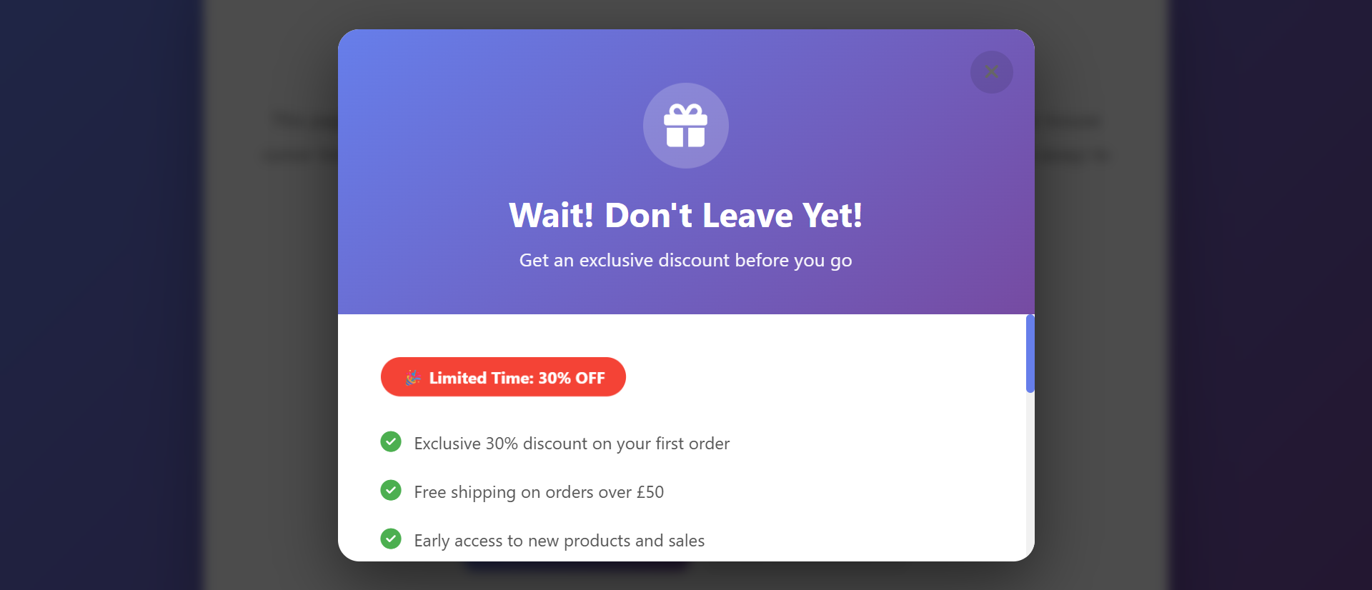
Popups appearing instantly on page load—before users even view content they came to see—create hostile first impression signaling "we prioritize our agenda over your needs." The interruption triggers psychological reactance: when autonomy threatened, people resist by opposing the threat source. Users arrived seeking specific information (product details, blog content, service specs); popup blocking that content feels like bait-and-switch manipulation. This disruption particularly damages new visitor relationships; first interaction being aggressive promotion establishes negative brand perception that subsequent positive experiences struggle to overcome. The "welcome" becomes unwelcome intrusion.
2. Content Blocking Creating Frustration and Exits
Full-screen or large modals physically preventing access to desired content until dismissed create friction exactly when users most motivated to engage. The forced interaction to close popup (finding X button, clicking outside modal, hitting escape) adds steps between arrival and content access—each step bleeding visitors. Mobile popups particularly problematic: overlay covering entire small screen with tiny close button creates frustrated multi-tap attempts to dismiss. The blocking communicates "see our promotion before accessing content you want"—prioritization creating resentment. Users exit rather than dismiss because closing popup feels like conceding to manipulation.
3. Timing Ignorance Interrupting Engaged Users
Popups triggering during active reading, mid-video viewing, or during checkout process interrupt flow states, destroying engagement momentum. Users absorbed in content experience popup as jarring disruption breaking concentration; they must context-switch from content consumption to popup assessment, then re-engage with original content—cognitive burden reducing comprehension and enjoyment. Exit-intent popups firing during accidental cursor movements create false alarms interrupting engaged users who weren't actually leaving. The mistimed interruptions communicate tone-deafness; effective marketing respects context rather than blindly interrupting regardless of user state.
4. Banner Blindness and Automatic Dismissal
Popup overuse across web has trained users in automatic dismissal: popup appears, hand moves to close button without reading, popup dismissed within 0.5 seconds—no message processing occurred. The instant dismissal means zero communication effectiveness despite maximum annoyance. Users develop "popup blindness" similar to ad banner blindness; the format becomes invisible due to learned irrelevance. The automation is so ingrained that users often can't recall what popup advertised 5 seconds after closing it. High visibility paradoxically creates zero attention; the intrusive format triggers avoid-and-dismiss reflex rather than engagement.
5. Mobile Experience Degradation and Penalties
Google explicitly penalizes intrusive mobile interstitials (popups covering significant content) in search rankings, recognizing their negative impact on mobile user experience. Mobile popups create disproportionate frustration: smaller screens mean larger coverage percentage, touch-based close buttons require precision tapping often taking 3-4 attempts, accidental content taps when aiming for close button trigger unwanted navigation. The mobile degradation particularly damaging given mobile comprises 60-70% of traffic for many sites. Popup-heavy mobile experiences drive users to competitors whose mobile sites respect limited screen real estate.
Ready to Promote Without Annoying Visitors?
See how promotional banner bars deliver persistent visibility without intrusive disruption, respecting user experience while driving conversions.
View Banner Bar Demo →6 Ways Promotional Banner Bars Transform Conversion
1. Persistent Non-Intrusive Visibility
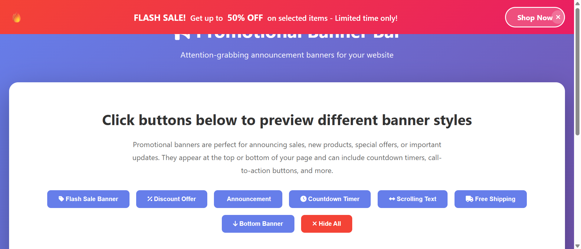
Banner bars—slim horizontal sections at top or bottom of page—provide continuous promotional visibility without blocking content access. The persistent presence means promotion seen on every page throughout session without requiring interruption or forced attention. Users can ignore banner focusing on content, or engage when interest arises—agency creating positive relationship versus forced popup interaction creating resentment. The "always there, never blocking" approach respects autonomy while maintaining promotional presence. Analytics show banner bars achieve 8-15x higher engagement rates than popups despite (or because of) their less aggressive presentation, proving non-intrusive persistence outperforms disruptive interruption.
2. Sticky Positioning Maintaining Awareness
Sticky banner bars remain fixed at viewport top or bottom during scrolling, maintaining visibility as users navigate page content. The constant positioning creates repeated exposure without repetitive popups; single banner seen continuously rather than multiple popup interruptions. The sticky presence enables delayed response: users can continue reading, then click banner when ready rather than forced immediate popup decision. This accommodates consideration process; promotions often require thought ("Is 20% off worth buying now?") impossible during interruption but natural during continued browsing. Sticky visibility serves users at their timeline rather than forcing marketer's timeline.
3. Easy Dismissal Respecting User Preference
Banner bars include prominent, easily-clickable dismiss button that permanently hides banner for that session (or indefinitely via cookie). The low-friction dismissal—single click, large target—communicates respect for user preference: "Here's our offer, dismiss if uninterested." This respectful approach paradoxically reduces dismissal; users feel less pressured when easy exit exists, often leaving banner visible. Popups' difficult-to-find close buttons or multi-step dismissals trigger reactance increasing desire to close and exit entirely. Cookie-based permanent dismissal prevents banner from becoming annoying through repetition; once dismissed, user experience becomes banner-free for return visits.
4. Contextual Messaging and Targeting
Smart banner bars display different messages based on page context, user segment, or behavior. Product pages show category-specific discounts ("20% off this collection"), blog readers see content upgrades ("Download free guide"), cart viewers receive shipping incentives ("Free shipping over $50"). The contextual relevance increases engagement 3-5x versus generic promotions; users respond when offer pertains to current activity. Geographic targeting enables regional promotions; location-based banners show local store events or region-specific offers. The intelligent targeting makes banner feel helpful rather than random advertising, transforming promotional tool into value-added service.
5. Mobile-Optimized Compact Design
Banner bars designed for compact messaging—single line or two-line format—consume minimal mobile screen space (40-60px height versus 100% for popups). The slim profile maintains content accessibility; users see 90% of article or product versus 0% during popup blocking. Touch-optimized dismiss buttons ensure single-tap closure without mis-taps. Responsive design adapts messaging for mobile: desktop shows full "Shop Our Black Friday Sale: 30% Off Sitewide + Free Shipping," mobile shows "Black Friday: 30% Off + Free Ship." The mobile-first design acknowledges mobile traffic dominance, treating mobile as primary experience rather than degraded desktop version.
6. Urgency Communication Without Pressure
Banner bars effectively communicate time-sensitive promotions through countdown timers or deadline messaging ("Sale ends in 4:23:17") without aggressive popup pressure. The persistent visibility means urgency messaging seen throughout browsing building awareness rather than creating panic-inducing interruption. Users can monitor countdown while browsing, feeling time pressure without coercion. The subtle urgency preserves positive brand perception; countdown banner feels informative ("FYI: sale ending soon") versus popup countdown feeling manipulative ("ACT NOW OR LOSE OUT"). Urgency without aggression drives action through awareness rather than anxiety.
5 Industries Where Banner Bars Drive Conversion
1. E-Commerce: Promotion and Free Shipping Thresholds
Online retailers increased average order value 267% using banner bars communicating promotions and dynamic shipping thresholds. Top-banner "Free shipping on orders over $50" increased cart sizes as shoppers added items reaching threshold. The persistent visibility throughout shopping journey kept benefit top-of-mind versus forgotten after popup dismissal. Promotional banners for sales events ("Winter Clearance: Up to 60% Off") maintained awareness across all pages without interrupting product browsing. Mobile shoppers particularly responsive; banner bars achieved 4x higher mobile engagement than popups due to non-intrusive design. Cart abandonment decreased 34% as banner promotions overcame price objections during checkout consideration.
2. SaaS and Digital Services: Trial and Discount Offers
Software companies increased trial signups 198% using banner bars promoting free trials and limited-time discounts. Top-banner "Start Free 14-Day Trial—No Credit Card Required" provided persistent call-to-action throughout product page browsing without blocking feature exploration. The non-intrusive presence let prospects fully research product then click banner when convinced, versus popup forcing premature decision before readiness. Holiday promotion banners ("25% Off Annual Plans—Holiday Sale Ends 12/31") drove 156% increase in annual plan purchases. The banner format suited B2B decision-making requiring extended consideration impossible during popup interruption.
3. Content Publishers: Newsletter and Membership Growth
Media sites and blogs increased email subscribers 234% through banner bars promoting newsletter signups and member benefits. Bottom-banner "Get Weekly Design Tips in Your Inbox—Join 47,000 Subscribers" converted readers without interrupting articles. The placement at content end captured engaged readers who just consumed value, making reciprocal email signup feel natural. Persistent visibility throughout multi-article reading sessions created multiple conversion opportunities versus single popup per session. Member-exclusive content banners ("Unlock Full Article—Become a Member") drove 189% increase in paid memberships by maintaining upgrade awareness without blocking free content access.
4. Event and Booking: Early-Bird and Deadline Urgency
Conference organizers and booking platforms increased early registrations 278% using countdown banner bars for early-bird pricing deadlines. Top-banner "Early Bird Pricing Ends in 5 Days—Save $200" maintained urgency awareness throughout event page exploration. The non-intrusive countdown let prospects review full agenda and speakers while monitoring deadline, enabling informed decisions versus popup pressure for snap judgments. Hotel booking sites used banners showing "3 Rooms Left at This Price" creating scarcity awareness without aggressive popups. The persistent visibility throughout booking consideration drove 167% increase in conversion by maintaining pressure without annoyance.
5. Professional Services: Lead Magnet and Consultation Offers
Consulting firms and agencies increased lead generation 223% through banner bars promoting downloadable resources and free consultations. Top-banner "Download Free Industry Report: 2024 Marketing Trends" captured leads without interrupting service page research. The persistent offer throughout multi-page exploration (services, case studies, about, team) created multiple conversion points versus single-page popup. Bottom-banner "Schedule Free 30-Minute Strategy Session" positioned consultation offer after prospects consumed credibility-building content, driving 198% increase in booked consultations. The timing control let prospects self-select readiness rather than popup forcing premature contact requests.
Transform Promotions From Annoying to Effective
Discover how promotional banner bars deliver persistent visibility and conversions without the frustration and exits caused by intrusive popups.
Explore Banner Solutions →The Psychology Behind Banner Bar Effectiveness
1. Psychological Reactance and Perceived Freedom
Reactance theory describes opposition triggered when people perceive freedom being threatened. Popups blocking content create freedom threat—"I can't access what I came for until dealing with this"—triggering resistance manifesting as immediate dismissal and negative brand feelings. Banner bars preserve freedom; users can ignore banner focusing on content, or engage when they choose. The agency eliminates reactance, making promotional message receivable rather than automatically rejected. Research shows messaging perceived as respecting autonomy achieves 3-5x higher acceptance than identical messaging presented coercively. Banner bars' non-threatening presence enables consideration impossible during popup interruption.
2. Mere Exposure Effect and Familiarity Building
Mere exposure effect describes increased preference for stimuli encountered repeatedly. Banner bars' persistent visibility creates repeated exposure—users see promotion on every page throughout session—building familiarity and positive association through repetition. Popups achieve single exposure before dismissal; banner achieves 5-20 exposures during typical multi-page session. The accumulating exposures increase promotional message acceptance and recall; users might ignore banner initially but after 6th exposure during session, message registers and motivates action. The effect works subconsciously; users unaware of influence but familiarity creates positive feelings toward promoted offer.
3. Cognitive Ease and Processing Fluency
Processing fluency theory shows information processed easily feels more true and trustworthy than difficult-to-process information. Banner bars' consistent positioning and simple messaging create cognitive ease—banner always in expected location with clear concise offer. Popups create cognitive difficulty through unexpected timing, varying designs, and attention-splitting interruption. The ease of banner processing ("Oh, the sale banner, still there if I want it") requires minimal cognitive resources. Popup processing ("Wait, what's this blocking my content? Where's the close button? What does it even say?") consumes resources creating negative affect. Processing ease makes promotional message feel natural rather than intrusive.
4. Selective Attention and Self-Determined Engagement
Attention is selective—people focus on information they deem relevant while filtering irrelevant stimuli. Banner bars enable selective attention; users interested in promotion can focus on banner, while uninterested users can filter it out continuing with content. This self-determination creates positive engagement; clicking banner represents genuine interest versus popup clicks often being "close" attempts or coerced engagement. The selective engagement quality surpasses quantity; fewer but more genuine banner interactions convert better than higher-volume but resentful popup interactions. Marketing effectiveness isn't about forcing attention—it's about being available when attention naturally directed toward your offering.
5 Common Banner Bar Implementation Mistakes
1. Excessive Height Consuming Screen Real Estate
Oversized banner bars—100px+ height on desktop, 80px+ on mobile—consume excessive screen space reducing visible content area. The intrusive size creates popup-like annoyance despite non-blocking positioning. Mobile particularly sensitive; 80px banner on 667px iPhone screen consumes 12% of viewport reducing content visibility. Best practice: 40-60px desktop, 50-70px mobile maximum. The constraint forces concise messaging (good discipline) while preserving content primacy. Test banner height impact on scroll depth and bounce rate; excessive size correlates with increased exits as users perceive content access difficulty.
2. Unclear Messaging and Missing Value Proposition
Vague banner messaging—"Special Offer Available" without specifics—provides insufficient information to motivate clicks. Users won't click to "discover" offer; banner must communicate complete value proposition: what's offered, benefit magnitude, any conditions. Compare "Shop Our Sale" (vague) versus "30% Off All Winter Gear + Free Shipping Over $50" (specific). The specificity enables informed decision; interested users click, uninterested dismiss. Generic messaging wastes banner space and user attention. Include urgency if applicable: "Ends Tonight" or "Limited Stock." Every word must work; banner's compact format demands precise communication.
3. Difficult Dismissal Creating Frustration
Missing close buttons, tiny X icons (smaller than 30x30px touch target minimum), or banners that re-appear after dismissal create popup-like annoyance. Users must be able to permanently dismiss banner with single effortless click. The close button should be visually obvious (contrasting color, clear X or "Dismiss" text) and positioned prominently (typically right side for left-to-right readers). Cookie-based dismissal should persist across session; banner reappearing after closure triggers frustration. Test dismissal on actual mobile devices verifying single-tap closure without mis-taps. Difficult dismissal turns non-intrusive banner into intrusive annoyance requiring immediate fix.