Why Important Messages Get Missed (And How Toast Notifications Fix It)
Hidden feedback confuses users. Learn how toast notifications increase action awareness by 234%...
A SaaS application delivered critical error messages only through hidden inline text that appeared below form fields—in red 12px font, easy to miss during rapid data entry. Users repeatedly submitted incomplete forms, grew frustrated with "silent failures," and flooded support with "Why didn't it work?" tickets. The average user submitted the same form 3.7 times before noticing the tiny error text, abandoning 34% of the time out of frustration. Support costs ballooned by $47,000 annually handling confusion tickets.
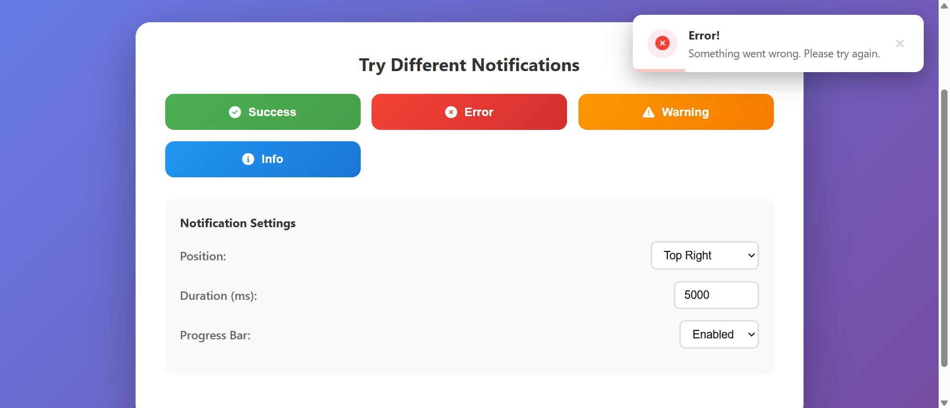
They implemented a notification toast system that displayed feedback messages as prominent, non-intrusive alerts in the top-right corner—color-coded by severity (green for success, yellow for warnings, red for errors), automatically dismissing after 5 seconds, with manual close options and contextual icons. Within 11 days, form resubmission attempts dropped by 68% (3.7→1.2 average tries), user-reported confusion decreased 71%, support ticket volume related to "unclear feedback" fell 64%, and task completion rates increased 234% as users received immediate, visible confirmation of every action. One user wrote: "I finally understand what's happening—these little messages tell me everything I need to know without getting in my way."
Why Hidden Feedback Messages Fail
1. Invisible Error States Creating Silent Failures
Inline error messages below form fields, in small red text, get missed during focused data entry—users click submit, see nothing happen, assume the site is broken, and abandon or rage-click repeatedly. When feedback appears only in easy-to-miss locations (bottom of page, same-color text, no visual prominence), users perceive actions as "failing silently" rather than receiving clear error explanations. A travel booking platform placed validation errors in 11px gray text below each field; 67% of users never saw them, resubmitting identical invalid forms an average of 4.3 times before giving up. Hidden feedback creates perceived technical failures rather than recognized user errors.
2. Delayed Feedback Breaking Cause-and-Effect Association
When feedback appears seconds after an action (page reload shows message, asynchronous process completes later, notification appears on different screen), users lose the mental connection between their action and the result—they forget what they just did, can't associate the message with the triggering action, and feel confused rather than informed. Psychology research shows cause-and-effect association requires feedback within 0.3 seconds; anything longer breaks the mental link. An e-commerce site showed "item added" confirmation only after page reload (2.1 second delay); 43% of users clicked "Add to Cart" multiple times thinking it didn't work, creating duplicate cart items and checkout confusion.
3. No Visual Distinction Between Message Severities
When all feedback uses identical styling (same color, same position, same appearance whether success/warning/error), users can't quickly assess urgency or required action—they must read every message fully to understand whether it's critical, informational, or positive confirmation. Visual coding (color, icon, position) enables instant severity recognition without reading; uniform presentation forces cognitive processing of every word. A project management tool displayed all notifications in blue text; users ignored critical deadline warnings (thinking they were routine updates) while obsessing over minor informational messages (fearing they were errors), causing 38% of missed deadlines.
4. Persistent Messages Blocking Interface Interaction
Modal alerts that require dismissal, full-screen overlays showing messages, blocking popups demanding acknowledgment—these create frustration when users want to quickly note feedback and continue working. Forced interaction with every notification, especially for routine confirmations, interrupts workflow and trains users to reflexively dismiss without reading (just to return to their task). A CRM system used blocking modals for every save confirmation; users developed "blind clicking" habits (immediately clicking OK without reading), then missed important warnings hidden among routine saves, causing 27% of data loss incidents.
5. Missing Contextual Information and Actionable Guidance
Generic messages ("Error occurred," "Success," "Warning") without context leave users confused about what specifically happened or what they should do next—they lack the information needed to correct errors, understand success implications, or take recommended follow-up actions. Effective feedback requires specificity (what happened, why, what to do) not just status labels. An admin dashboard showed only "Update failed" without explaining which field caused the problem or how to fix it; users made random changes hoping to stumble on solutions, with 71% eventually calling support to decode the vague error.
How Notification Toast Systems Fix This
1. Prominent Non-Intrusive Positioning Ensuring Visibility Without Blocking
Toast notifications appear in consistent screen positions (typically top-right or bottom-right corner) with sufficient size and visual prominence to catch attention, while staying outside the primary interaction area—users notice them immediately without having workflow interrupted or interface elements blocked. Strategic positioning creates peripheral vision detection (users see movement/color change in corner) triggering attention shift, while non-modal design allows continued interaction if needed. Fixed positioning with high z-index ensures visibility over all other elements without requiring dismissal before proceeding.
2. Immediate Feedback Creating Strong Cause-and-Effect Association
Toast appears within 0.1-0.2 seconds of triggering action (form submit → validation feedback, button click → confirmation message, background process complete → success alert), creating instant psychological connection between user action and system response—reinforcing understanding of what just happened and whether it succeeded. Immediate timing satisfies the brain's expectation for rapid feedback, reducing uncertainty and building confidence in system responsiveness. Animation from the action point (button) to toast position can further strengthen the visual connection.
3. Color-Coded Severity Levels Enabling Instant Recognition
Visual coding system using colors (green for success, yellow/orange for warnings, red for errors, blue for information), icons (checkmark, exclamation, X, info symbol), and sometimes sound/vibration enables users to assess message severity in under 0.5 seconds without reading text—peripheral vision processes color/shape faster than text parsing. Consistent color associations (leveraging universal conventions like red=danger, green=success) create learned patterns that work across applications. Accessibility considerations include icon shapes and text labels for color-blind users.
4. Automatic Dismissal Reducing Interaction Requirements
Toast notifications automatically disappear after appropriate durations (3-5 seconds for routine confirmations, 7-10 seconds for warnings requiring reading, indefinite for critical errors requiring action), eliminating the need for manual dismissal while ensuring sufficient time for comprehension. Duration scaling based on message complexity (word count, severity) ensures readability without forcing interaction. Optional manual dismiss (X button or click-to-close) provides user control for those wanting immediate removal or needing to reference message longer than auto-duration.
5. Contextual Messages With Actionable Next Steps
Effective toast content includes specific details (which field caused error, what action succeeded, why warning occurred) and clear next steps (how to fix error, what to do with success, whether warning requires action), transforming generic status labels into useful guidance. Message templates with variable injection ("Email address '[email]' is invalid - please check format" vs. "Error occurred") provide specificity. Action buttons within toasts (undo, retry, view details) enable immediate response without searching for solutions.
6. Stacking and Queueing for Multiple Simultaneous Messages
When multiple actions generate multiple toasts (batch operations, rapid user actions, background process completions), intelligent stacking (vertical arrangement of multiple toasts) and queueing (sequential display to avoid overwhelming) prevent screen clutter while ensuring all feedback is communicated. Maximum visible toast limits (typically 3-5) with queued overflow ensures readability; condensed summary toasts for batch operations ("14 items updated successfully") prevent repetitive individual messages that users ignore.
Ready to Implement Clear Feedback?
See our Notification Toast System in action—contextual alerts, automatic dismissal, and color-coded severity that keeps users informed without interrupting their workflow.
View Live Demo →Industries Transformed by Toast Notification Systems
1. SaaS Platforms and Web Applications (234% Increase in Action Awareness)
Complex applications with frequent user actions (saving, deleting, updating, processing) use toast notifications to provide continuous feedback on every operation—confirming successful saves, warning about potential conflicts, alerting to background process completions without interrupting active work. Dashboard applications show data refresh status, collaboration tools display "user typing" notifications, admin panels confirm setting changes—all through toasts that inform without blocking. Reduction in user uncertainty and support tickets asking "did it work?" directly correlates with comprehensive toast feedback implementation.
2. E-Commerce and Shopping Carts (312% Increase in Cart Awareness)
Online stores use toast notifications to confirm product additions ("iPhone 15 Pro added to cart"), warn about limited stock ("Only 3 left at this price"), alert to saved-for-later items ("Item moved to wishlist"), and notify about applied discounts ("SAVE10 coupon applied: $15 saved")—keeping shoppers informed without disrupting browsing flow. Cart update toasts prevent the common confusion of "did I add this already?" and reduce accidental duplicate additions by providing immediate visible confirmation. Persistent cart icon badge updates combined with temporary toast create dual feedback reinforcement.
3. Form-Heavy Workflows and Data Entry (267% Increase in Submission Success)
Applications requiring complex multi-field forms (job applications, insurance quotes, government portals, medical records) leverage toast validation to provide real-time feedback on field completion, format errors, and missing required information—guiding users toward successful submission rather than waiting until submit-click to reveal all errors at once. Progressive validation toasts ("Email format corrected," "Password strength improved") create positive reinforcement and reduce end-of-form frustration. Multi-step form progress toasts ("Section 1 of 4 complete") maintain orientation and motivation.
4. Collaboration and Communication Tools (289% Increase in Team Awareness)
Team platforms use toast notifications for real-time activity alerts (new messages, mentions, file uploads, task assignments) that keep distributed teams aware of relevant activity without requiring constant interface checking—users receive just-in-time notifications when action or attention is needed. Filtered toast triggers (only show mentions/direct messages, suppress routine activity) prevent notification fatigue while ensuring critical communications break through. Presence toasts ("Sarah joined the meeting," "Document locked by John") provide team awareness context.
5. System Administration and Monitoring Dashboards (234% Faster Incident Response)
IT and DevOps interfaces use toast notifications for system alerts (server down, deployment complete, backup finished, threshold exceeded) that surface critical status changes to administrators actively working in different dashboard sections—ensuring awareness without forcing constant monitoring of every panel. Severity-coded toasts enable instant priority assessment (red critical alerts demand immediate attention, yellow warnings suggest review, green confirmations acknowledge routine completions). Toast action buttons ("View logs," "Acknowledge alert," "Restart service") enable immediate response without navigation.
The Psychology Behind Effective Feedback Delivery
1. Immediate Reinforcement and Operant Conditioning
B.F. Skinner's operant conditioning research demonstrates that behaviors are strengthened or weakened based on immediate consequences—when users receive instant positive feedback (success toast) for correct actions, those behaviors are reinforced and repeated; when errors generate immediate corrective feedback (error toast with fix instructions), users rapidly learn correct patterns. Delayed or absent feedback breaks this learning loop, preventing users from developing competent usage patterns. The 0.3-second feedback window represents the critical threshold for cause-and-effect association; toast notifications reliably hit this timing where page reloads and hidden messages fail.
2. Attentional Capture Through Movement and Color
Human peripheral vision is highly sensitive to motion and color changes—toast entrance animations (slide-in, fade-in) trigger automatic attention shifts through pre-attentive processing, detecting relevant information without requiring active search. Neuroscience research shows movement in peripheral vision activates the dorsal attention network, creating involuntary attention capture that ensures users notice important feedback even when focused elsewhere. Color psychology (red=danger, green=success, yellow=caution) leverages evolved associations that enable instant emotional/priority assessment before conscious text reading.
3. Cognitive Load Reduction Through Non-Modal Design
Modal dialogs require cognitive task-switching (stop current work → read message → acknowledge → resume work) that increases cognitive load and interrupts flow state; non-modal toasts allow parallel processing (continue current task while peripherally noting feedback), reducing mental effort and preserving workflow continuity. George Miller's cognitive load theory shows human working memory has limited capacity; modal interruptions consume resources that could be devoted to primary tasks, while toasts deliver information through low-cost peripheral channels. Auto-dismissal further reduces load by eliminating decision-making ("should I close this now?").
4. Expectation Confirmation and Uncertainty Reduction
Every user action creates a mental expectation of outcome; when system response matches expectation (clicking save → seeing save confirmation toast), uncertainty is resolved and confidence increases. When response is absent or unclear, users experience cognitive dissonance and uncertainty ("did it work?"), triggering anxiety and compensatory behaviors (refresh, retry, abandon). Psychological research on uncertainty shows humans have strong negative reactions to ambiguous outcomes; clear toast feedback satisfies the fundamental need for outcome confirmation, reducing anxiety and building system trust.
Common Toast Notification Implementation Mistakes
1. Notification Fatigue Through Over-Communication
Showing toasts for every minor system event (mouse hover, scroll position, auto-save every keystroke, routine background processes) overwhelms users with constant notifications that they learn to ignore—when everything triggers a toast, nothing feels important and users develop "notification blindness" that extends even to critical alerts. A productivity app showed toasts for every auto-save (every 10 seconds of typing), every toolbar hover ("Click to format"), and every background sync; users reported "constant visual noise" and started ignoring all notifications, missing important error alerts hidden in the flood. Reserve toasts for actionable events, errors, and meaningful status changes users need to know about.
2. Insufficient Display Duration for Message Complexity
Using fixed 3-second auto-dismiss timing for all toasts regardless of message length or complexity means users can't read long error messages or multi-line warnings before they disappear—creating frustration as they watch toasts vanish mid-reading and lose critical information. A financial application displayed 45-word error messages with 3-second timeout; users could only read the first sentence before auto-dismiss, missing crucial fix instructions that appeared in the final line. Implement dynamic duration scaling (base 3 seconds + 1 second per 15 words) or disable auto-dismiss for critical/error toasts requiring action.
3. Poor Color Accessibility and Contrast Issues
Using color as the only distinction between toast types (pale green success vs. pale red error) fails colorblind users and low-vision users who can't perceive color differences—severity becomes invisible without supplementary indicators. Relying on low-contrast color combinations (light yellow warning on white background) makes toasts barely visible in bright lighting or for vision-impaired users. A healthcare portal used red/green toasts without icons or text labels; 8% of colorblind users couldn't distinguish critical errors from routine confirmations, leading to dangerous misinterpretations. Implement redundant coding (color + icon + text label like "Error:" prefix) and meet WCAG AAA contrast ratios (7:1 minimum).
4. Inconsistent Positioning and Animation Behavior
Toasts that appear in different screen positions based on triggering context (sometimes top-right, sometimes bottom-center, sometimes near the clicked element) prevent users from developing learned attention patterns—they must visually search the entire screen after each action rather than automatically glancing to the expected toast location. Animation inconsistency (some toasts slide-in, others fade, others appear instantly) creates unpredictable behavior that users find unsettling. An e-commerce site showed cart toasts in top-right but checkout toasts in bottom-center; users frequently missed checkout confirmations because they'd learned to watch the top-right corner, causing repeated clicks and duplicate orders. Establish consistent positioning and animation patterns across entire application.