Why Static Case Studies Get Skimmed (And How Animated Showcases Fix It)
Text-heavy case studies bore readers. Learn how animated showcases increase read completion by 312%...
The 5 Critical Problems With Traditional Text-Heavy Case Studies
1. Wall-of-Text Format Overwhelms Scanners
Modern web readers scan rather than read linearly, seeking key information through visual hierarchy and skimmable formatting. Traditional case studies presenting continuous paragraphs of methodology, challenges, solutions, and results create cognitive overload that triggers immediate abandonment. Users seeking quick validation ("Did this work for someone like me?") can't efficiently extract answers from dense narrative prose. Eye-tracking studies show users spend 10-15 seconds scanning case studies before deciding to read or abandon—text-heavy formats fail this critical first impression. The irony: companies invest weeks creating comprehensive case studies that prospects dismiss in seconds due to presentation format alone.
2. Buried Metrics Fail to Highlight Transformation Impact
The most compelling case study elements—quantified results showing transformation magnitude—often appear buried mid-paragraph or in concluding sections users never reach. "Increased revenue 234%" hidden within narrative text lacks visual prominence to capture attention and communicate impact instantly. Prospects scanning for social proof need immediate metric visibility to gauge solution effectiveness. When results are text-only without visual emphasis, they become functionally invisible to scanners. This presentation failure wastes the most valuable case study content: concrete evidence your solution delivers measurable outcomes.
3. Linear Narrative Prevents Self-Directed Exploration
Different prospects prioritize different case study elements: some need industry-specific validation, others seek particular use case scenarios, technical buyers want implementation details, executives need ROI proof. Traditional linear case studies force all readers through identical sequential narrative regardless of their specific information needs. This one-size-fits-all approach wastes prospects' time on irrelevant sections while potentially hiding their priority information deep in document. The friction drives abandonment before users locate personally-relevant content, losing leads who might convert if they could efficiently navigate to their specific concerns.
4. Static Presentation Fails to Convey Process Journey
Effective case studies demonstrate transformation journey from problem state through implementation to achieved results—but static text struggles to convey this progression dynamically. The before-state challenges, intervention steps, and after-state outcomes blend into undifferentiated narrative without clear visual separation showing evolution. Prospects can't easily grasp the transformation magnitude or implementation timeline when presentation treats all phases identically. Visual storytelling through progressive reveal, timeline animation, or before-after comparison sliders communicates journey more effectively than chronological paragraphs.
5. Mobile Case Study Experience Becomes Unusable
Dense 2,000+ word case studies formatted for desktop reading become virtually unusable on mobile devices where small screens turn paragraphs into endless scrolling marathons. Mobile users (often 50-60% of B2B traffic) abandon case studies at even higher rates than desktop visitors because scrolling fatigue makes completing long-form content physically uncomfortable. Navigation challenges compound when mobile users can't efficiently jump to relevant sections—forcing sequential reading of entire document. The mobile failure particularly damages prospects in discovery phase who browse on phones during commutes or between meetings, eliminating prime conversion opportunities.
Ready to Transform Case Study Engagement?
See how animated showcases turn skimmed case studies into compelling visual proof that drives conversions.
View Animated Showcase Demo →6 Ways Animated Showcases Transform Case Study Impact
1. Progressive Metric Reveals Build Anticipation
Animated showcases use staged metric reveals showing results progressively rather than all-at-once, creating narrative tension that maintains engagement. Starting with problem-state baseline metrics, animation reveals improvement increments building to final results—"Revenue: $340K → $520K → $780K → $1.2M" shown sequentially with smooth transitions. This progressive disclosure leverages curiosity gap psychology where partial information creates desire to see complete picture. The animation pacing controls information delivery preventing cognitive overload while building anticipation for impressive final numbers. Compared to static "revenue increased 253%" text, animated progressive reveal makes identical metric dramatically more engaging and memorable.
2. Visual Before-After Comparison Sliders
Interactive before-after sliders allow prospects to personally control comparison between pre-solution and post-solution states, creating tactile engagement impossible with static images. Users drag slider revealing transformation at their own pace—seeing cluttered interface become streamlined, slow dashboard become real-time, or manual process become automated. The interactivity creates ownership of discovery; prospects reveal transformation themselves rather than passively viewing it. This self-directed exploration increases comprehension and retention compared to side-by-side static comparisons. The slider format particularly excels for visual products (design, UI/UX improvements) where showing transformation impact exceeds describing it.
3. Animated Timeline Navigation With Jump Points
Interactive timelines visualize case study journey from initial challenge through implementation phases to final results, with clickable waypoints allowing non-linear navigation. Users can jump directly to implementation details, skip to results, or explore challenges section—self-directing their experience based on priority interests. The timeline provides visual progress indicator showing journey scope and current position, reducing "how long is this?" uncertainty that triggers abandonment. Animation brings timeline alive: hovering waypoints previews content, clicking expands detailed sections, progress indicator shows completion status. This structure serves both comprehensive readers (following full timeline) and scanners (jumping to priority sections).
4. Metric Visualization Through Animated Charts
Animated data visualizations transform static percentage claims into compelling visual proof through bar charts, line graphs, or gauge animations building from baseline to final results. Watching chart bars grow from problem-state lows to solution-enabled highs creates emotional impact that "increased 312%" text lacks. Color-coded metrics (red problem metrics transitioning to green success metrics) provide instant visual comprehension requiring no analysis. Multiple related metrics can animate in sequence showing how improvements in one area cascaded to others—visualizing cause-effect relationships impossible to communicate through text alone. Animation speed calibrated to allow comprehension without feeling rushed.
5. Scroll-Triggered Animation for Progressive Story
Scroll-based animation reveals case study sections progressively as users scroll down, creating continuous discovery experience rather than static all-at-once presentation. Elements fade in, metrics count up, timelines extend, and testimonials appear as users navigate content—rewarding scroll engagement with visual feedback. This progressive reveal prevents overwhelming users with complete case study all at once while maintaining forward momentum through scroll-triggered discoveries. The animation provides subconscious progress feedback: "I'm making progress through this content and discovering new information" rather than confronting undifferentiated text wall. Scroll-triggered animation particularly effective on mobile where scroll is natural interaction pattern.
6. Video Testimonial Integration With Key Moment Clips
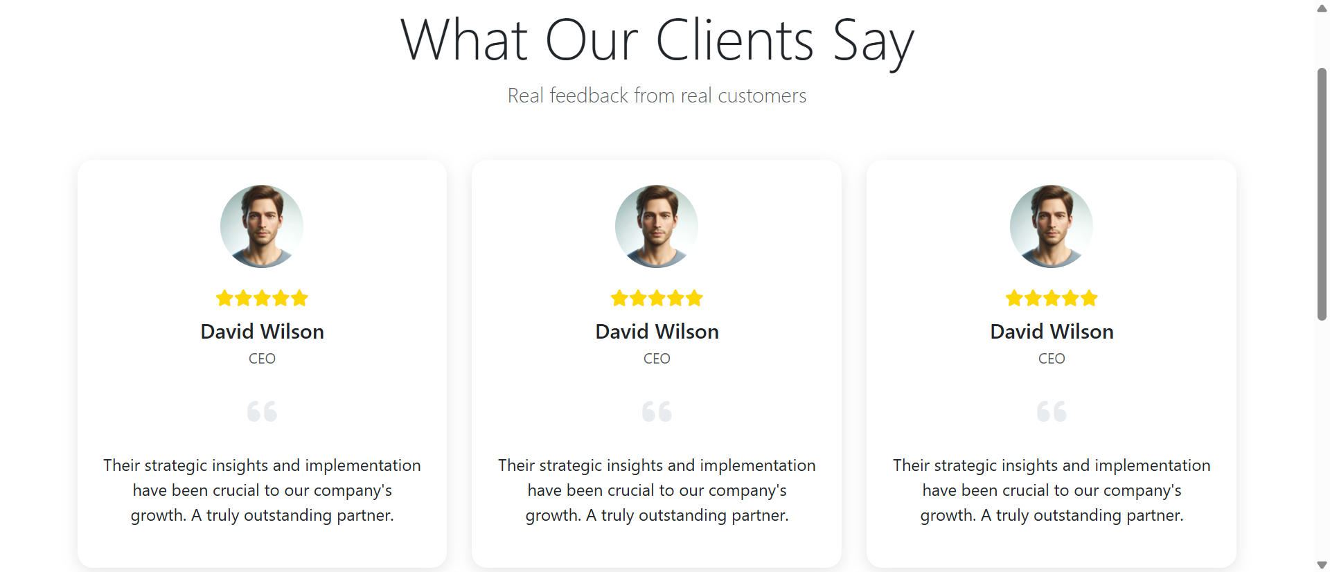
Animated showcases embed short video testimonial clips (15-30 seconds) at strategic points reinforcing key claims with authentic customer voice. Rather than linking external full testimonial videos users ignore, inline clips auto-play when scrolled into view—catching attention through motion and delivering concentrated emotional proof. Clips timestamp specific transformation moments: customer describing initial frustration, implementation ease, or achieved results. The video authenticity (facial expressions, vocal tone, genuine emotion) builds trust impossible through written testimonials alone. Strategic placement intersperses video proof throughout case study maintaining engagement through format variety preventing monotonous text-only experience.
5 Industries Where Animated Case Studies Drive Conversions
1. B2B SaaS: Complex Solution Simplification
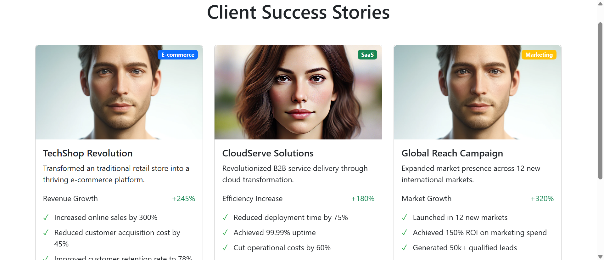
Software companies with sophisticated multi-feature platforms increased case study conversion 267% through animated showcases visualizing implementation journey and metric transformations. One project management SaaS created animated timeline showing 90-day implementation with progressive metric reveals: team efficiency +34% month 1, +67% month 2, +112% month 3. Interactive feature adoption charts let prospects explore which capabilities drove results. The visual storytelling helped prospects grasp complex value proposition that dense text case studies failed to communicate, reducing sales cycle 23% as leads arrived pre-educated.
2. Professional Services: Intangible Results Visualization
Consulting firms and agencies struggling to showcase intangible service outcomes improved case study engagement 189% through animated metric dashboards and process visualizations. One management consulting firm created animated showcase showing client operational efficiency journey: starting chaos state (red indicators, low scores) transforming through intervention phases (yellow transitioning indicators) to optimized end-state (green indicators, high scores). The visual transformation communicated consulting impact more effectively than methodology descriptions, increasing proposal request rate 78% from case study visitors.
3. E-Commerce Technology: Revenue Impact Demonstration
E-commerce platform providers increased trial signups 234% using animated revenue growth visualizations in case studies. Interactive line charts showed merchant revenue trajectories: flat pre-platform adoption, then hockey-stick growth post-implementation. Users could hover timeline points revealing specific growth milestones and platform features driving results. Before-after store screenshots with comparison sliders showed UX improvements. The visual proof of revenue transformation convinced skeptical merchants where text-only statistics failed, particularly among visual-oriented retail entrepreneurs.
4. Healthcare Technology: Patient Outcome Improvements
Medical software companies improved case study credibility 156% through animated patient outcome dashboards showing clinical metrics transformations. One telehealth platform created showcase with animated health indicator improvements: patient engagement rates, medication adherence, symptom management scores all visualized as gauges filling from baseline to post-implementation levels. HIPAA-compliant anonymized patient journey timelines showed treatment progression. The visual outcome proof resonated with clinician audiences trained to process data visually, increasing qualified demo requests 91%.
5. Manufacturing: Process Efficiency Visualization
Industrial automation providers increased case study effectiveness 198% using animated factory floor visualizations and efficiency metric reveals. Interactive before-after comparisons showed production line layouts: cluttered manual processes becoming streamlined automated workflows. Animated charts revealed throughput increases, defect rate decreases, and labor cost reductions building progressively. Video clips showed actual machinery in operation proving real-world implementation. The visual proof addressed engineer skepticism better than specification sheets, shortening enterprise sales cycles 34%.
Create Compelling Visual Proof
Discover how animated case study showcases transform static stories into engaging visual journeys that convert prospects.
Explore Showcase Solutions →The Psychology Behind Animated Case Study Effectiveness
1. Narrative Transportation and Emotional Engagement
Psychological research on narrative transportation shows that stories presented through progressive reveal create stronger emotional engagement than all-at-once presentation. Animated showcases leverage this by controlling information flow, building tension through staged metric reveals and transformation visualization. Users experience customer journey rather than reading about it, creating empathy and identification impossible through static text. The emotional engagement activates memory encoding; prospects remember animated case study stories weeks later while forgetting text-only versions immediately. This recall persistence influences purchasing decisions during later evaluation stages.
2. Visual Processing Superiority and Retention
Humans process visuals 60,000x faster than text and retain visual information at 65% after three days versus 10% text retention. Animated case studies exploit this biological advantage by encoding key metrics, transformations, and outcomes visually rather than textually. The combination of motion (animation), visual data (charts), and narrative (story progression) creates multi-modal encoding strengthening memory formation. Prospects retain "I saw that chart showing 312% growth" more reliably than "I read they increased revenue 312%"—visual memory proving more durable and accessible during decision-making.
3. Cognitive Ease Through Progressive Disclosure
Progressive information disclosure reduces cognitive load compared to comprehensive all-at-once presentation, making content feel easier to process. Animated showcases reveal sections incrementally—challenge, then solution, then results—allowing processing of each phase before introducing next. This staged presentation prevents the overwhelming feeling that triggers abandonment when confronting dense case studies. The perceived ease of processing (cognitive fluency) creates positive affect toward content and brand, influencing trust and purchase intent beyond actual information conveyed.
4. Agency and Exploration Through Interactivity
Interactive elements (timeline navigation, before-after sliders, expandable sections) give prospects agency in exploration, increasing engagement and information retention. Self-directed discovery creates ownership of insights: "I found this information" feels more valuable than "I was told this information." The exploratory interaction activates curiosity and reward systems; discovering impressive metrics through personal interaction feels more credible than passively viewing identical information. This psychological ownership increases persuasive impact of case study content.
5 Common Animated Case Study Implementation Mistakes
1. Over-Animation Creating Distraction Not Clarity
Excessive animation—every element spinning, bouncing, or transitioning continuously—overwhelms rather than enhances, creating carnival effect that obscures message. Effective animation serves content by directing attention to key information; gratuitous animation distracts from it. Implement animation purposefully: metric reveals build anticipation, timeline progression shows journey, before-after comparisons demonstrate transformation. Use subtle, smooth animations (fade-ins, gentle slides) rather than aggressive effects (spins, bounces, explosions). Test whether animation enhances comprehension or becomes spectacle users tune out. Less animation, more thoughtfully applied, achieves greater impact.
2. Slow Load Times Destroying First Impressions
Animated showcases requiring 8+ seconds to load lose 40% of visitors before content displays—animated case studies worthless if prospects abandon before seeing them. Optimize animation implementation through lightweight CSS/JavaScript rather than heavy video files, lazy-load sections appearing below fold, and provide immediate static content while animations load progressively. Test on 3G mobile connections (not just office WiFi) ensuring acceptable performance for all users. Implement loading indicators showing progress rather than blank screens creating "is this broken?" uncertainty. Performance optimization isn't optional; it determines whether animated showcase gets seen.
3. Mobile Experience Degradation
Desktop-designed animations often fail on mobile: complex interactions become impossible on touch interfaces, large animations don't fit small screens, and heavy JavaScript slows mobile processors. Design mobile-first with touch-friendly interactions, simplified animation appropriate for smaller viewports, and performance budgets accounting for mobile limitations. Test on actual mobile devices (not just desktop browser resize). Consider alternate presentations: desktop might use hover-triggered animations while mobile uses scroll-triggered or tap-activated versions. Mobile users comprise majority of traffic; neglecting mobile animation experience wastes showcase investment.
4. Accessibility Barriers Excluding Users
Purely visual animations without text alternatives exclude screen reader users, auto-playing videos without captions frustrate deaf users, and rapid animations trigger motion sickness for vestibular disorder sufferers. Implement accessibility features: provide text descriptions of animated content for screen readers, i